How to configure Super Form module?
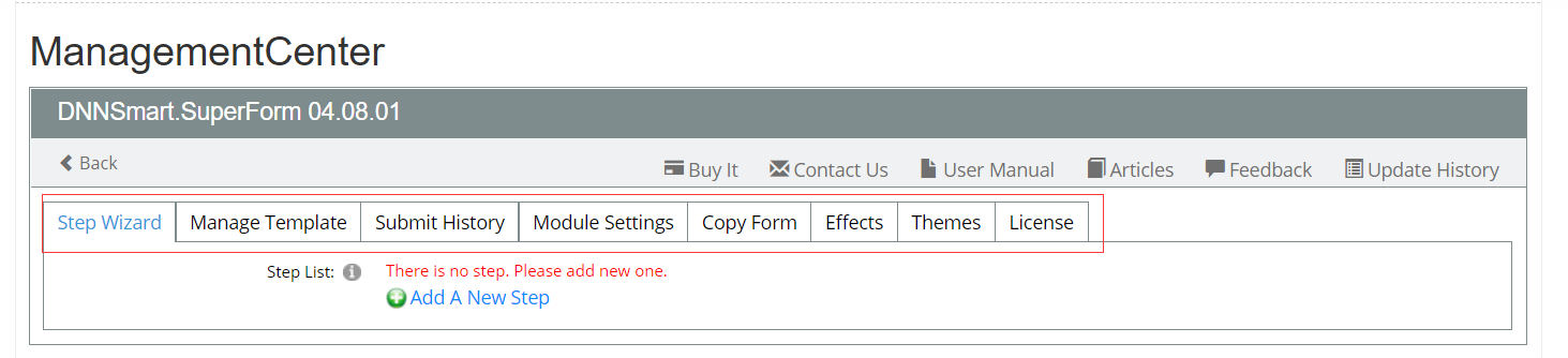
After you enter Management Center, you will get eight tabs as below.
Step Wizard
On this page, you can determine how many steps are included in your form. In each step, you can determine what fields are included.
How to add steps?
When you add steps, you need to add one step name for each step. In each step, you can custom template. If you don’t check option “Is Customize Template”, it will load default template. If you check that option, you can customize template through HTML code. You can add steps without limitation, so you can determine how many steps according to your need.
Please see animation (Add steps.gif) below, we added three steps as an example.

For each option, we have clarifications as below.
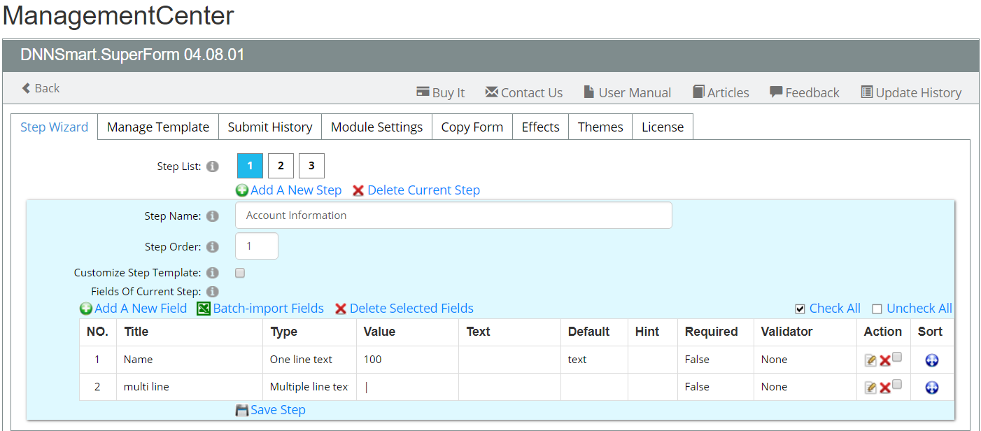
Step List: All steps are displayed. In our example, we added three steps and it displayed “1, 2, 3” here.
Step Name: The title of current step
Step Order: The order of this step
Customize Step Template: If this option is checked, you can customize template through HTML code. If this option is unchecked, it will load default template.
Fields Of Current Step: It will list all fields added in current step.
How to add fields in each step?
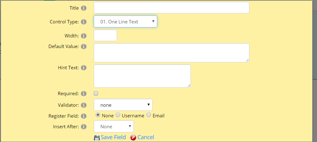
When you add fields in each step, you need to fill title, type, value and so on.
Please see animation (Add fields.gif) below, we added one field as an example.

After clicking “Add A New Field”, it will display the page as below. (This interface will be slightly different when you choose different control types from the dropdownlist.)
Next, we will explain how to add fields in each kind of countrol type one by one.
01. One Line Text
When you choose One Line Text control type, it will display as below.
Please see our clarifications for all options as below.
Title: The title of this field
Control Type: There are different controls included, you can select one from dropdownlist.
If you choose textbox type and use Email Validator, this field can be used as CC. Visitors can fill each email address by using [;] to separate.
Width: The width of textbox. For example, you can fill in “100”, “200” and so on.
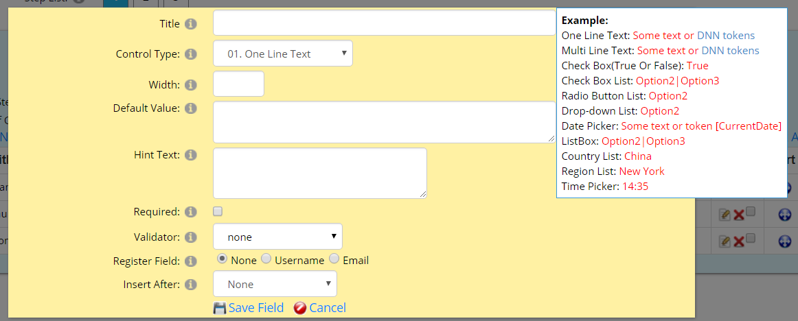
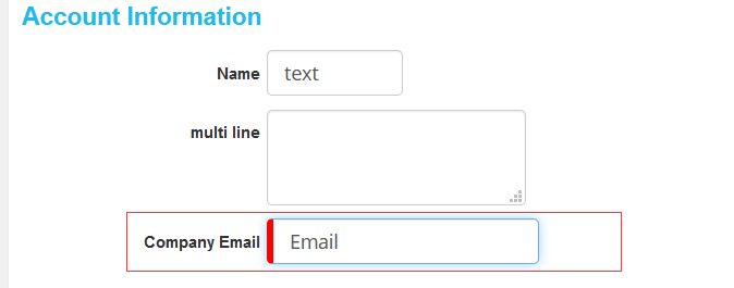
Default Value: The default value will display when the form preloads.
In our example (animation) above, we filled “Email” as default value. In the form front-end, it will display as below.
When your mouse hovers the lower right corner of the default value box, it will display a box which includes examples. You can refer to examples when you fill in default value.
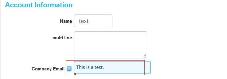
Hint Text: When your mouse hovers control, it will appear hint text. If you don't fill in hint text here, then hint text won't display in the frontend.
For example, we filled in “This is a test” here. It will display in the frontend as below.
Required: If this option is checked, this field will be mandatory.
Validator: You can choose a validator type for this field.
Register Field: You can make this field as a username or email to register a dnn user.
Insert After: This field will be inserted after which field.
02. Multi Line Text
When you choose Multi Line Text control type, it will display as below.
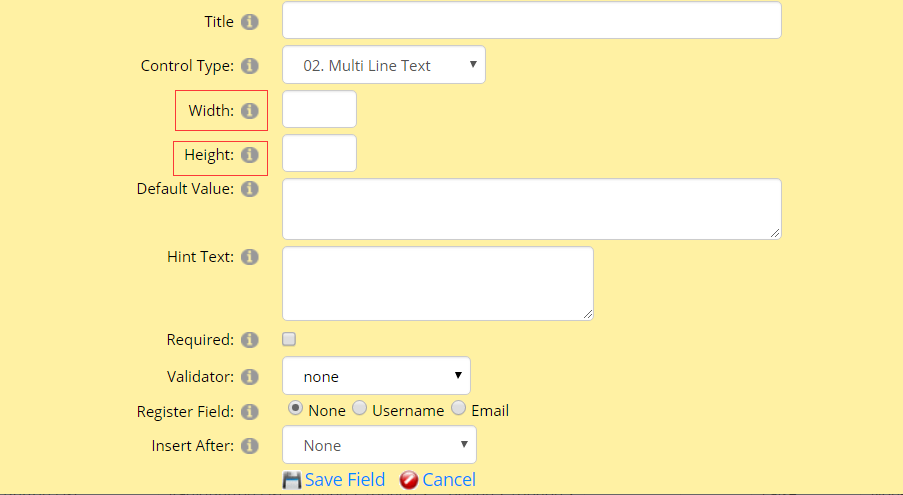
Width: The width of the textbox
Height: The height of the textbox
For explainations on other options, please refer to One Line Text control type above.
03. Check Box
When you choose Check Box control type, it will display as below.
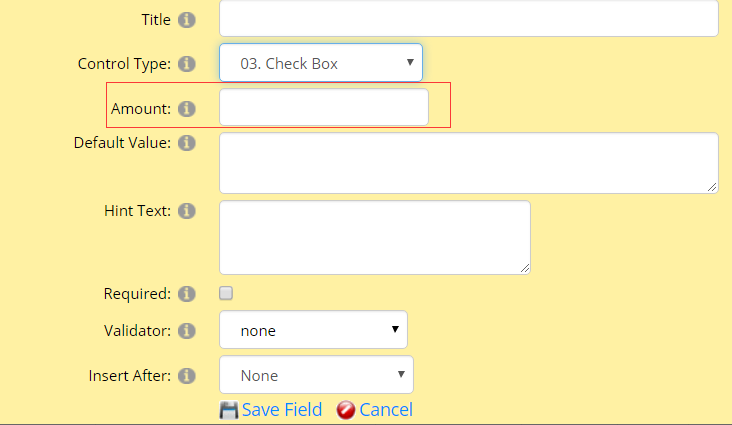
Amount: This field is used for calculation form or payment form.
For explainations on other options, please refer to One Line Text control type above.
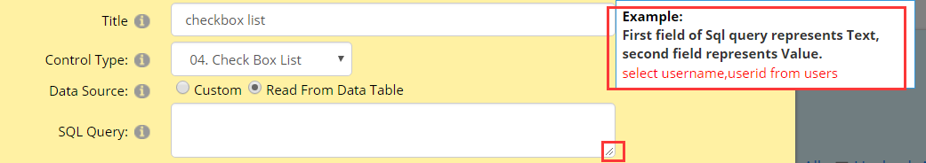
04. Check Box List
When you choose Check Box List control type, it will display as below.
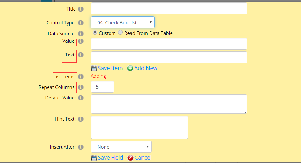
Data Source option
Data Source: It’s the data source of the list, you can customize it or read from database. It has two different options for you.
If you choose “custom”, you need to manually add each item. See below, you need to fill in “Value” and “Text”.
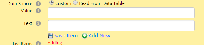
Value: You need to input a value of the List Item, this value will be only visible in the back-end and it won’t display in the front-end.
Text: You need to input the text of the List Item, what you input will display in the front-end.
Value and Text should be corresponding, you will understand this through the example below.
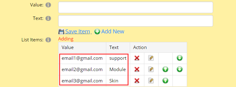
List Items: All added items will be in the list.
Please note, after you finish filling out “Value” and “Text”, please don’t forget to click “Save Item”.
We added several items as an example, see below.
Please see front-end interface as below.
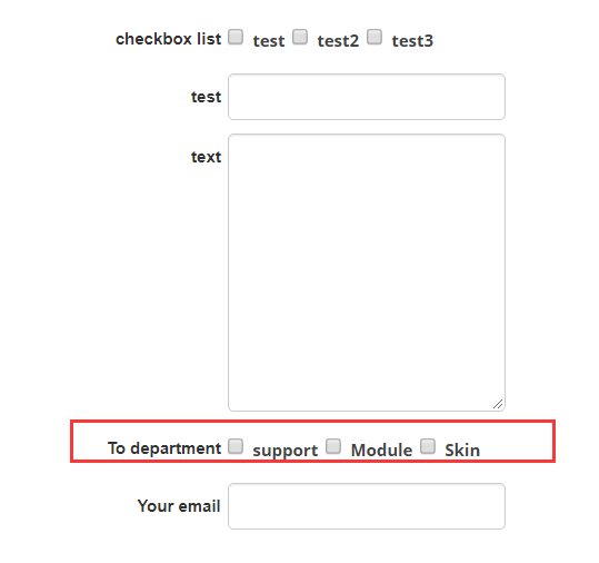
Users can choose one department to receive emails through using this form. For example, if users check “support”, then email1@gmail.com will get emails.
If you choose ”Read From Data Table”, the interface will be as below.
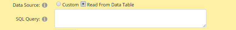
SQL Query: Please excute a sql query to get a data.
When your mouse hovers the lower right corner of the box, it will display a box which includes examples.
Repeat Columns option
This field will only appear in “Radio Button List” and “Checkbox List” controls, It indicates how many items are displayed in each row
For explainations on other options, please refer to One Line Text control type above.
05. Radio Button List
When you choose Radio Button List control type, it will display as below.
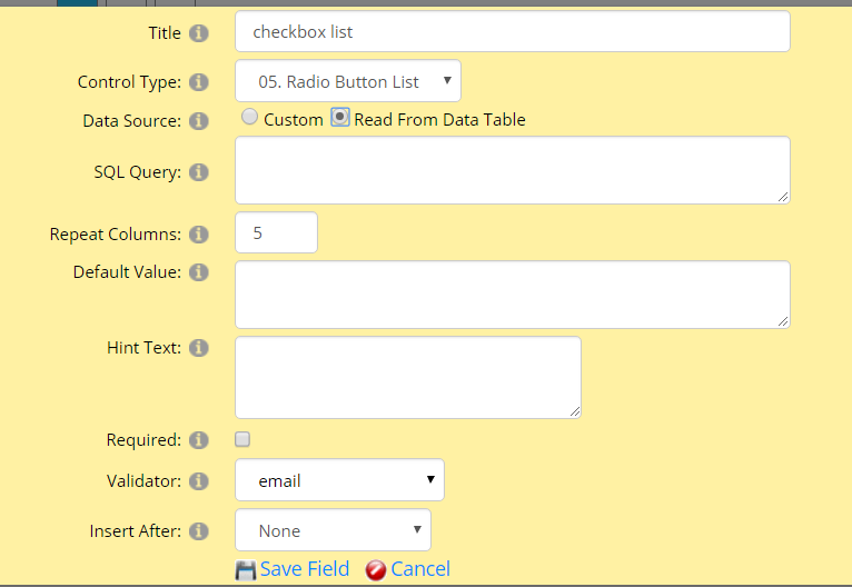
For explainations on all options, please refer to Check Box List above as they have the same ones.
06. Drop-down List
When you choose Drop-down List control type, it will display as below.
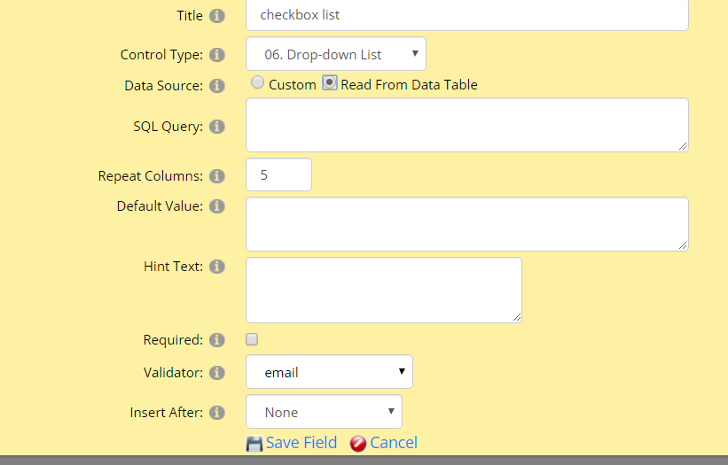
For explainations on all options, please refer to Check Box List above as they have the same ones.
07. File Upload
When you choose File Upload control type, it will display as below.
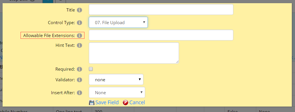
Allowable File Extensions: Through this option, you can configure which types of files are allowed to upload by users. If leaving it blank, it means that there’s no restriction on file formats.
Considering the security of the website, we sugguest not leaving it blank and restrict on the file format of uploaded files.
For explainations on other options, please refer to One Line Text control type above.
08. Date Picker
When you choose Date Picker control type, it will display as below.
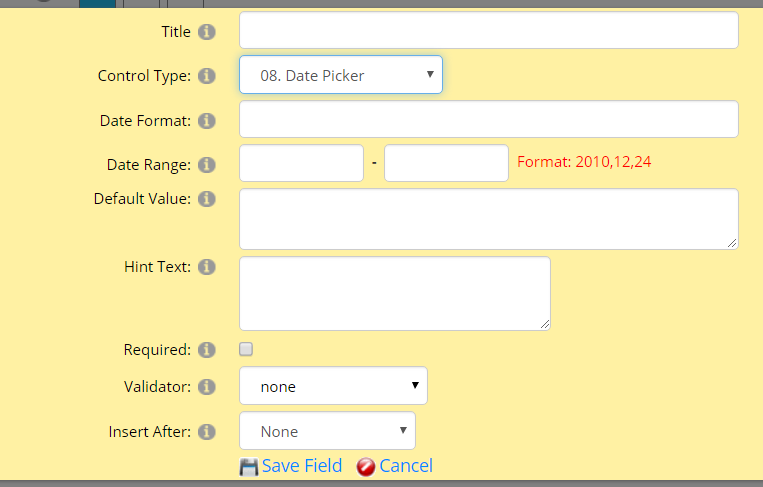
Date Format: It's the format of date which will display in the front-end.
For examle, it's 24th Dec, 2020 today. If you input dd-mm-yy here, it will display “24-12-2020” in the front-end after you choosing today.
Date Range: It's the date range that can be selected. For the date outside this range, it can't be selected directly.
For explainations on other options, please refer to One Line Text control type above.
09. List Box
When you choose List Box control type, it will display as below.
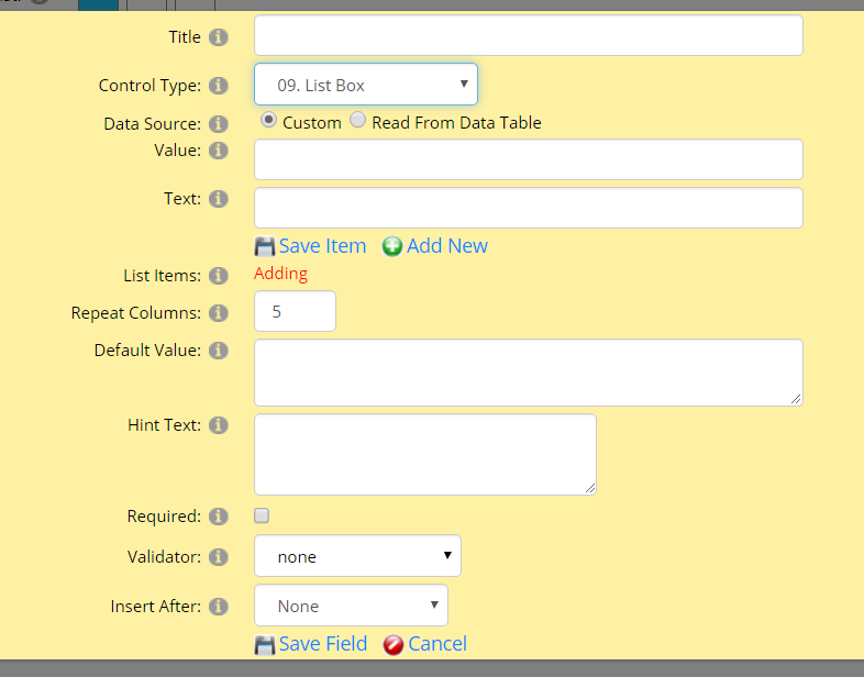
For explainations on all options, please refer to Check Box List above as they have the same ones.
10.Country List
When you choose Country List control type, it will display as below.
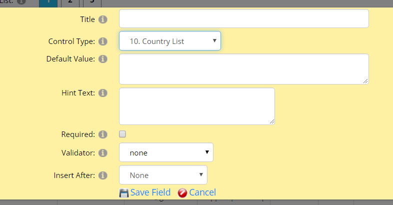
For explainations on all options, please refer to One Line Text control type above.
In the front-end, there will appear a dropdownlist which includes all countries.
11.Region List
When you choose Region List control type, it will display as below.
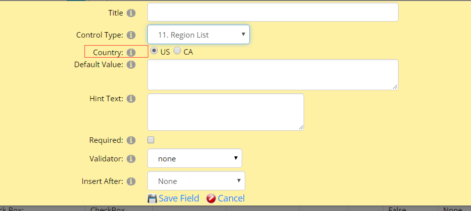
Country: There are two options for you. If you choose “US”, there will appear a dropdownlist which includes all regions of US in the front-end. Then you can select one from that dropdownlist. If you choose “CA”, there will appear a dropdownlist which includes all regions of Canada in the front-end. Then you can select one Canada state. This data will read from DNN database.
For explainations on other options, please refer to One Line Text control type above.
12.Time Picker
When you choose Time Picker control type, it will display as below.
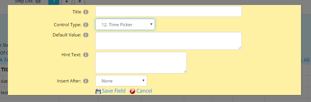
For explainations on all options, please refer to One Line Text control type above.
13.Subtotal
When you choose Subtotal control type, it will display as below.
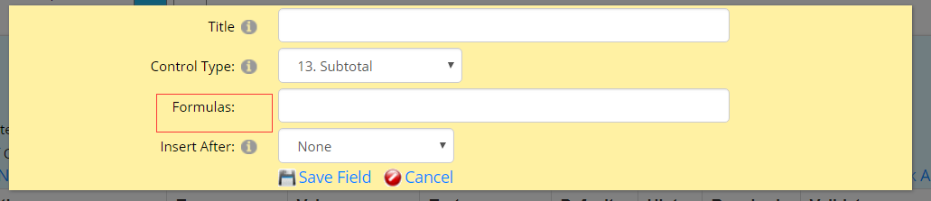
Formulas: If the calculation function is enabled in your form, you can fill in a mathematical formula here to calculate certain fields. Please see the example below, it represents calculating the product of the second field and the third field.
Example: [Step1Field2]*[Step1Field3]
For explainations on other options, please refer to One Line Text control type above.
Manage Template
On this page, there are five tabs included as screenshot below.
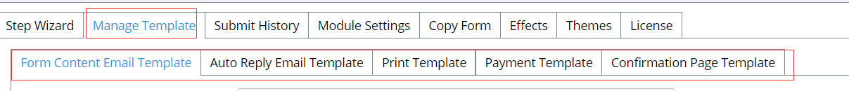
Form Content Email Template
In this tab, you can custom template of the form content email according to your need or you can load default template.
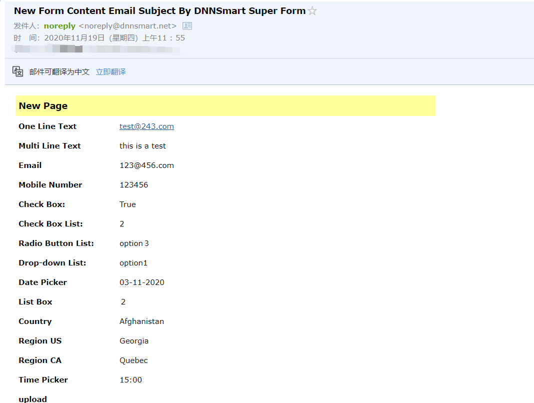
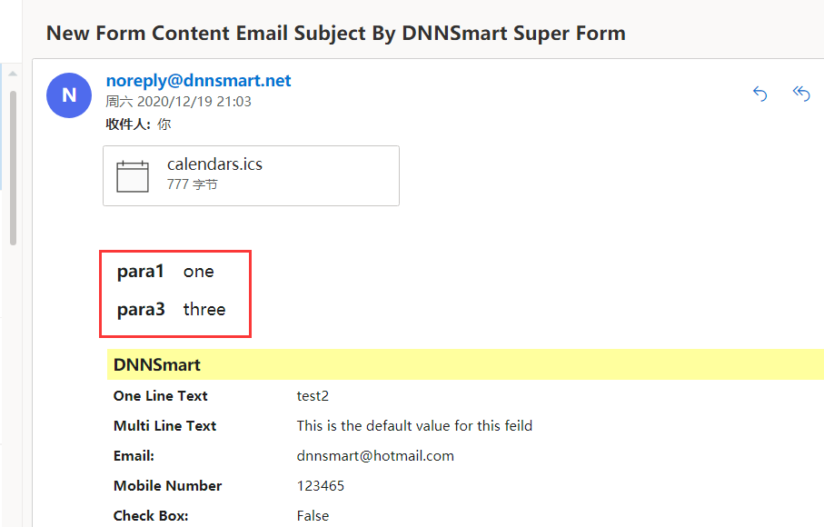
What’s one form content email? After users submit the form successfully, one email containing all submitted data will be sent to email receiver or submitters(users).
Please see an example below, it’s one form content email sent to email receiver.
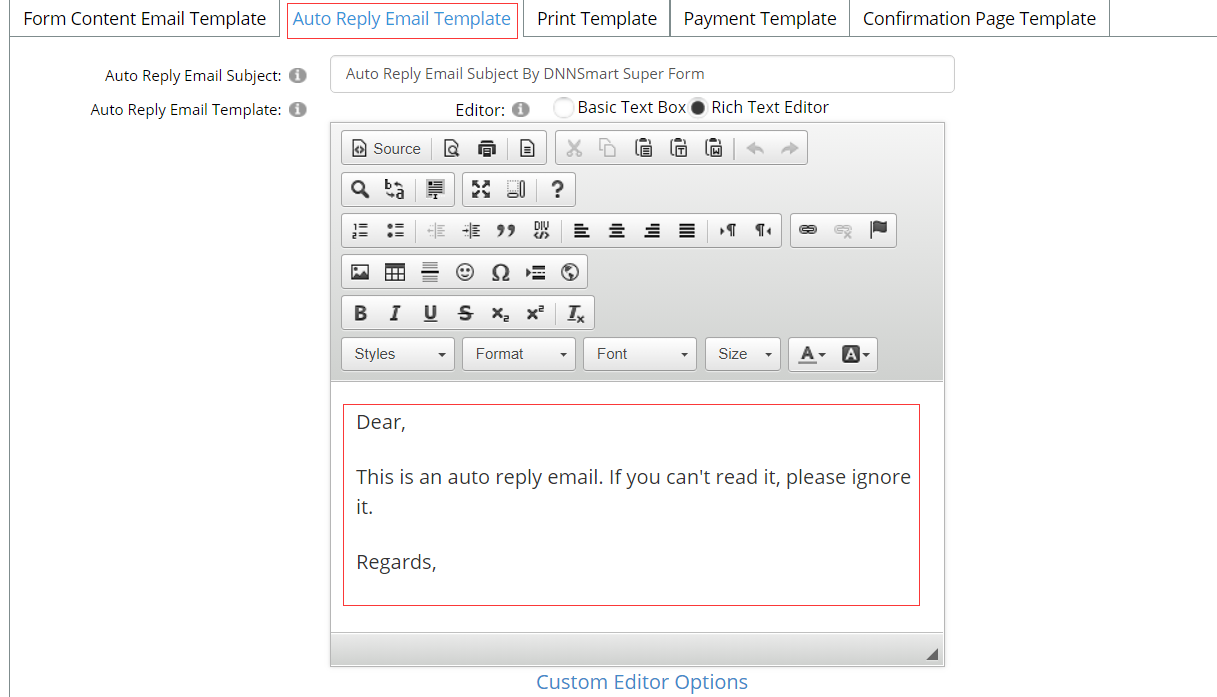
Auto Reply Email Template
In this tab, you can custom template of the auto reply email according to your need or you can load default template.
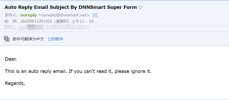
What’s an auto reply email template? After users submit the form successfully, submitters(users) will get one auto reply email.
Please see an example below, it’s one auto reply email sent to email receiver.
See the template section as blow.
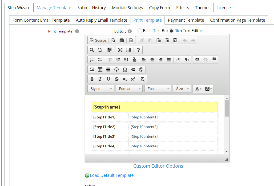
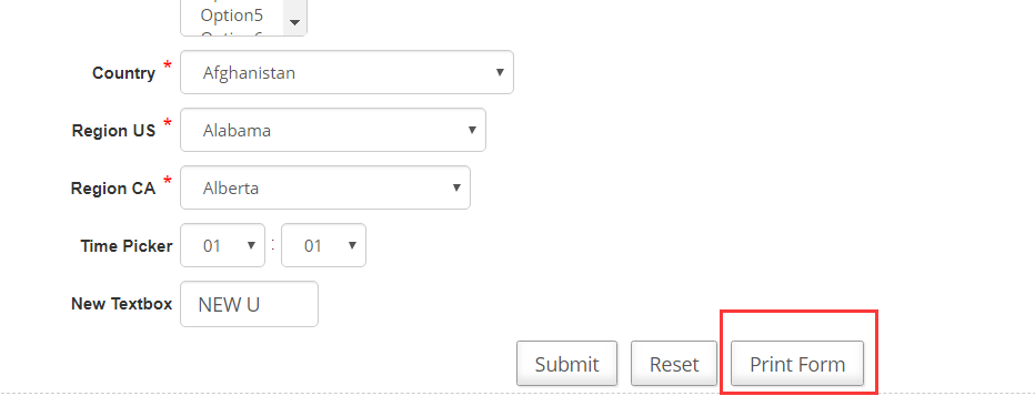
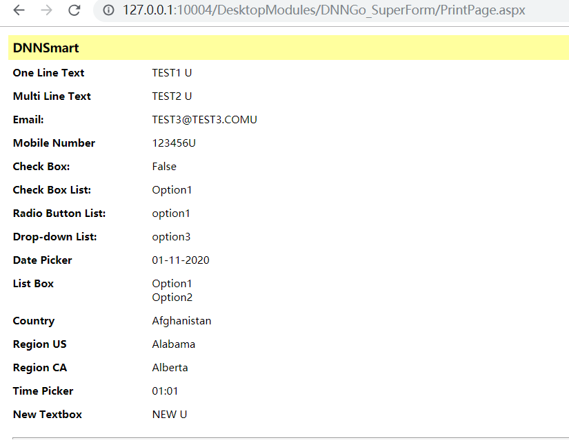
Print Template
In this tab, you can custom template of the page which users want to print.
Please see screenshots below, then you will see.
Payment Template
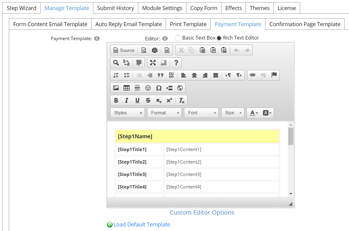
See screenshot above, you can customize payment template.
After clicking submit button, it will redirect to payment confirmation page and it will start payment process after clicking Checkout.
Confirmation Page Template
Oh this page, you can customize the template of confirmation page or load the default template.
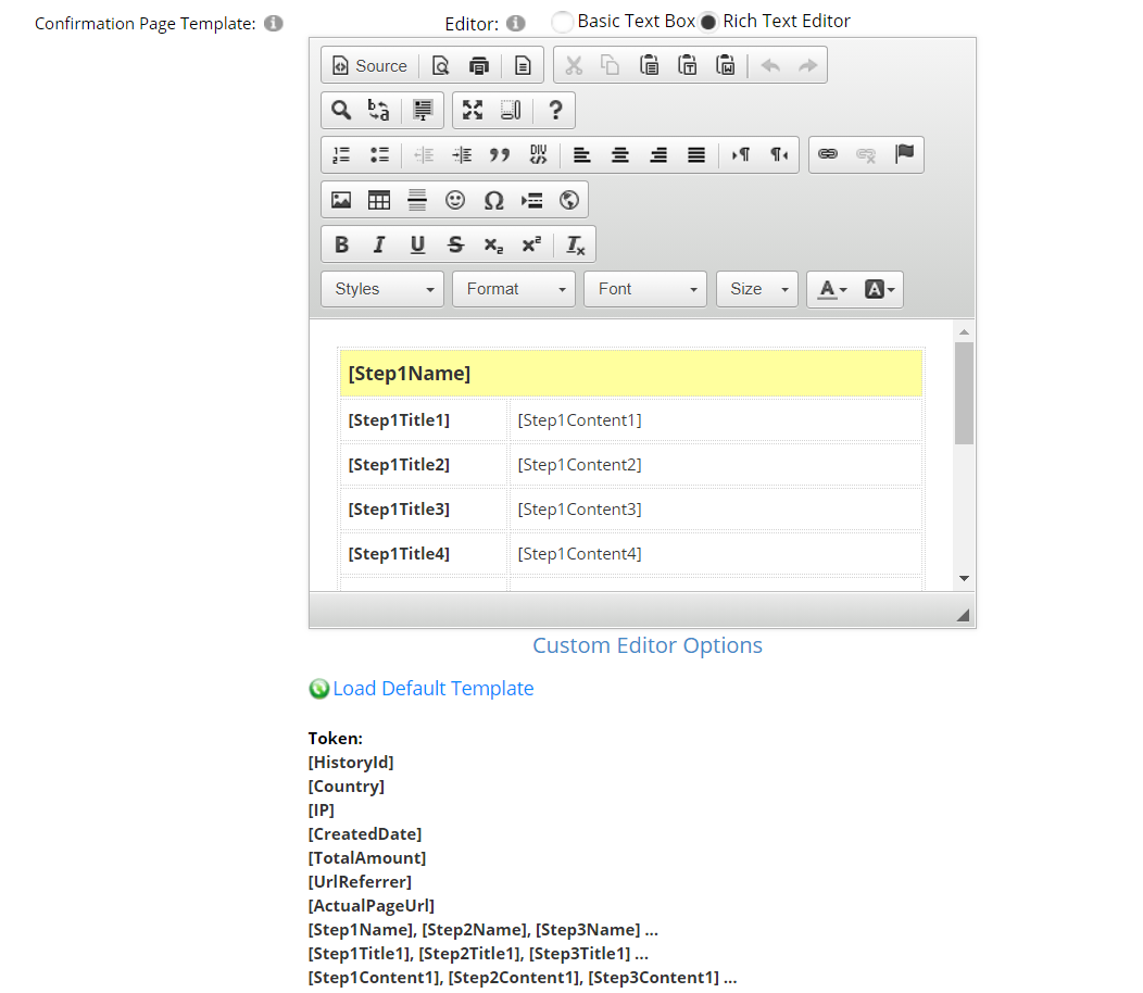
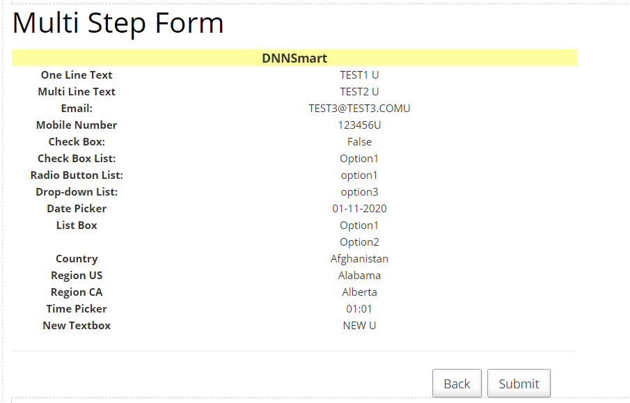
What’s a confirmation page? Please see below.
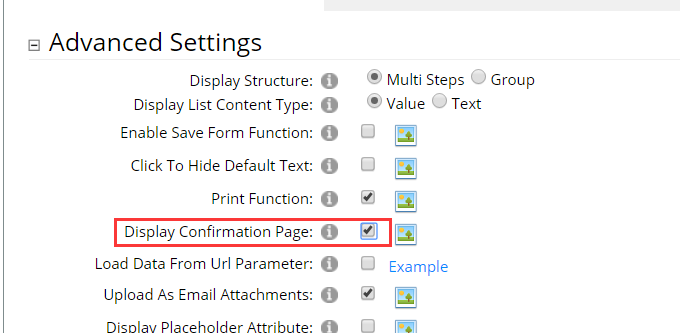
After you check “Display Confirmation Page” option in the back-end, it will display one confirmation page before submitting the form. See below.
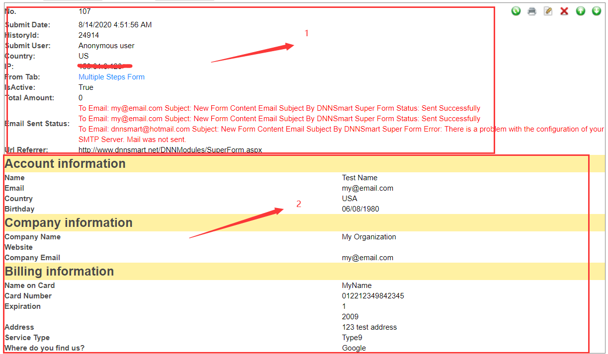
Submit History
On this page, you can check all records of all users’ submissions. For each record, it can be divided into two parts.
For the first part, it includes some information about submitters, such as submit date, historyID, username, country and so on.
For the second part, it includes all data filled out by this user.
Please see screenshots below.
For each option, we have clarifications as below.
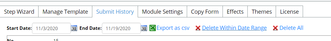
Export as csv: Admin can get all submission records in the selected date range, all submission records will be exported as one csv file.
Delete Within Date Range: All submission records in the selected date range will be deleted.
Delete All: All submission records will be deleted.
Module Settings
On this page, there are following four tabs included.
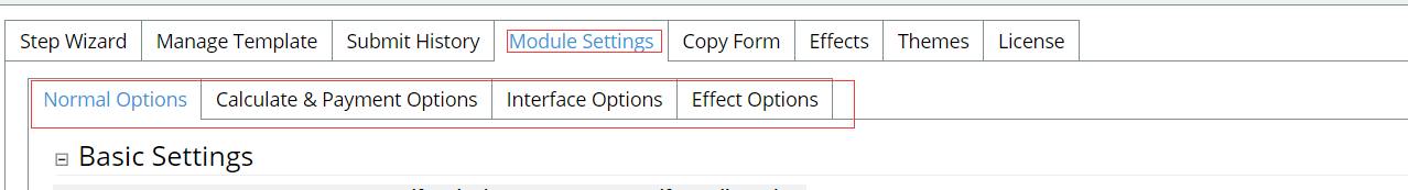
Normal Options
Basic Settings
Form Content Email: You can configure whether to send “Form Content” email to submitters or receivers.
Auto Reply Email: You can configure whether to send “Auto reply” email to submitters or receivers.
Use Captcha: After checking this option, captcha feature will be enabled.
Display Reset Button: After checking this option, reset button will display.
Email Receiver: It represents email receivers of the form, you can add Email addresses separating by a semicolon (;) here.
Email Sender: This is the email sender of the form, please input an email address. It also supports textbox field token, eg.[Step1Content1], [Step1Content2], [Step1Content3]... Email sender won’t receive any email, it only presents who sends emails. After submitter gets an email and he clicks “Reply” button, Email sender will be filled as email receiver automatically.
Redirect Type: This is redirect url after submitting the form. If you select “None”, it will display the submit result.
Advanced Settings
Display Structure: You can choose the structure of the form, multi steps or group.
Display List Content Type: This option is valid in only four kinds of controls and they are dropdownlist,radiobutton list, checkbox list, listbox. In these four controls, each item has one Text and one Value (Please refer to previous section of the document, there’s explaination on Text and Value). Text will display in the front-end, Value will be only configured in the back-end and Value will participate in some payment calculation functions. If you configure “Content Type” to be “Text” here, then both front-end and back-end will display Text and Value will become meaningless.
Enable Save Form Function: Allow your users to save their form and resume at a later time. When users come back and want to finish filling out the form next time, they just need to click one "Restore Form” button to restore the form and proceed.
Click To Hide Default Text: This option can only be used in TextBox control type. After checking this option, default text will disappear when users click Textbox.
Print Function: If this option is checked, print function will be enabled. Then submitter can print the page where it includes all data filled out by him/her, this page will appear before he/she submits the form.
Display Confirmation Page: If this option is checked, it will display a confirmation page after users finish the form.
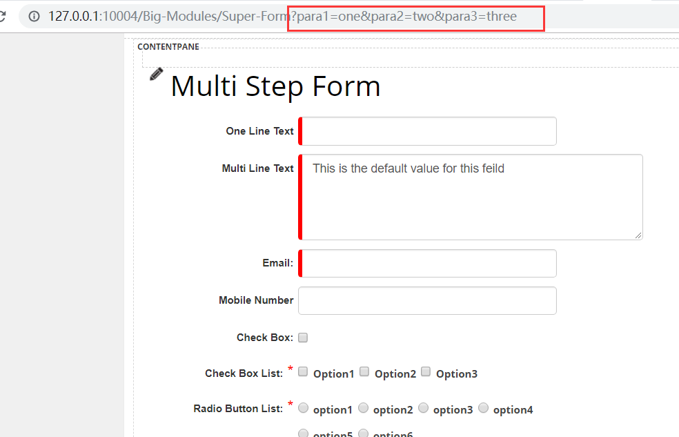
Load Data From Url Parameter: If this option is checked, the form will load data from url parameter. You can check demo site below to understand this option.
http://www.dnnsmart.net/en-us/dnnmodules/superform/loaddatabyurlparameter.aspx
Upload As Email Attachments: If you check this option, the file uploaded through File Upload control will be added as email attachment which will be sent to submitters or email receiver. See below.
Display Placeholder Attribute: If this option is checked, placeholder will be displayed in the form. This option can only be used in textbox control type. See below.
Limit Duplicate Submission By User: If you don’t want the same one log-in user to submit the form repeatedly, you can check this option.
Limit Duplicate Submission By IP: If you don’t want the same one IP to submit the form repeatedly, you can check this option.
All Emails Are From "Email Sender": If you dont' check this option, emails are from "form submitter".
Display Required Marker: Whether to display required marker.
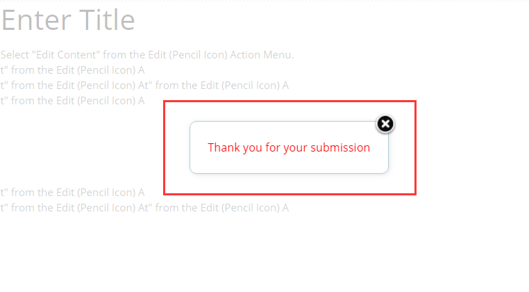
Popup Submit Result: Whether to popup submit result. See below, it’s an example.
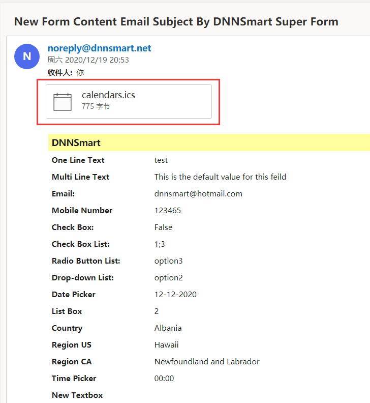
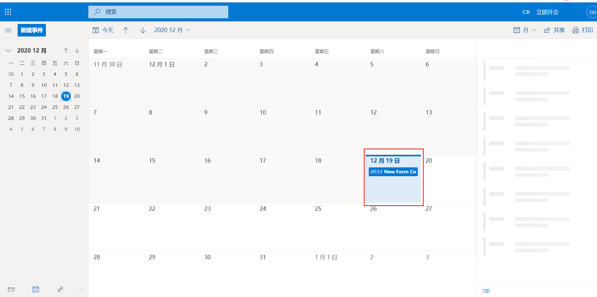
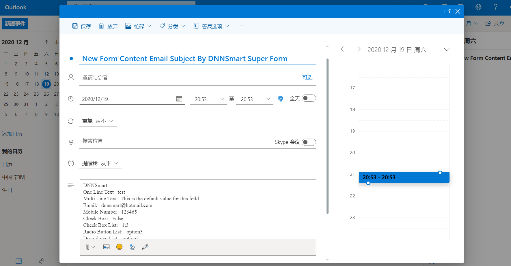
Export Submitted Content To ICS: If you check this option, contents of the form will be exported to an ICS file and sent to the recipient after users submit the form. In that case, the mail recipient can easily import the file in Google or Outlook calendar. See screenshots below, then you will see.
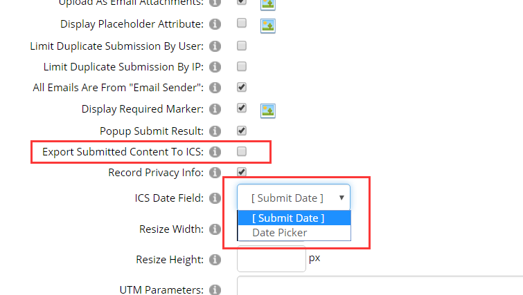
Record Privacy Info: After a user submits the form, the admin can control whether to record private information such as IP and Country of the user. As laws in some countries don't allow programs to collect user privacy information, admin can determine whether to enable this feature through this option.
ICS Date Field: Please select a field as the date of ICS file. If you don’t choose, submit date will be the ics date in default.
Resize Width: Resize the width of uploaded image.
Resize Height: Resize the height of uploaded image.
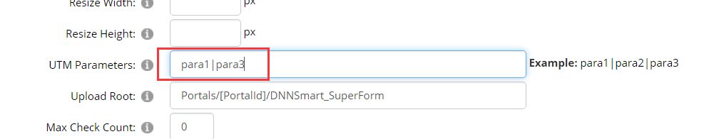
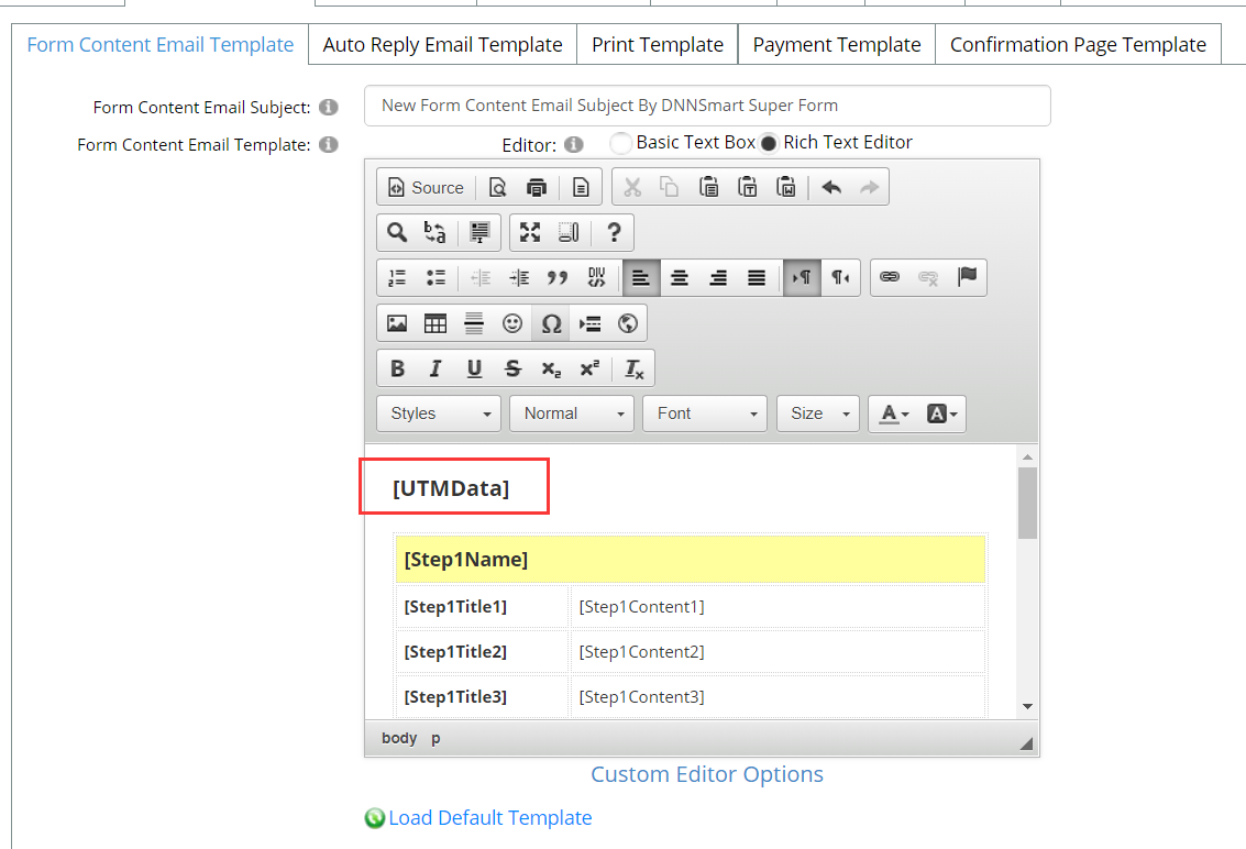
UTM Parameters: When the user submits the form, the parameter specified in the URL and its values will be saved. If you add [utmdata] token in the email template, this parameter and its values will be displayed in the email. See screenshots below, then you will see.
Upload Root: This is the root of uploaded files.
Max Check Count: This option is only valid in checkbox control type. You can configure the max count of checkboxes which will be checked, 0 presents unlimited count.
Clear Expired History: You can configure it automatically clears all submission history before how many days. Filling in zero means it won’t clear automatically.
Operation After Submitting
Execute SQL: Whether to execute SQL after users submit the form.
Database: Operate which database.
SQL Script: Please input sql script, you can fill token here.
Send Web Request After Submit: After submitting form, you can configure it to send data to one URL as "POST" or "GET" type.
Web Request Url: You can configure URL of receiving data here. On this URL page, you can receive data through other programming.
Assign Roles: This option is used for logged-in users.
Calculate & Payment Options
On this page, there are some options on calculation and payment feature.
Send Email To Submitter Before Payment: Whether to send form content email to submitters before they make payment. If admin check this option, it will send one email containing all submitted data to submitters before they make payment.
Send Email To Submitter After Payment: Whether to send form content email to submitters after making payment. If admin check this option, it will send one email containing all submitted data to submitters after they make payment successfully.
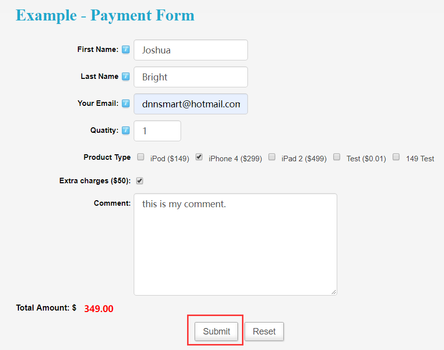
Display Payment Confirmation Page: Whether to display payment confirmation page.
Please see an example below, it’s the confirmation page which will display before making payment.
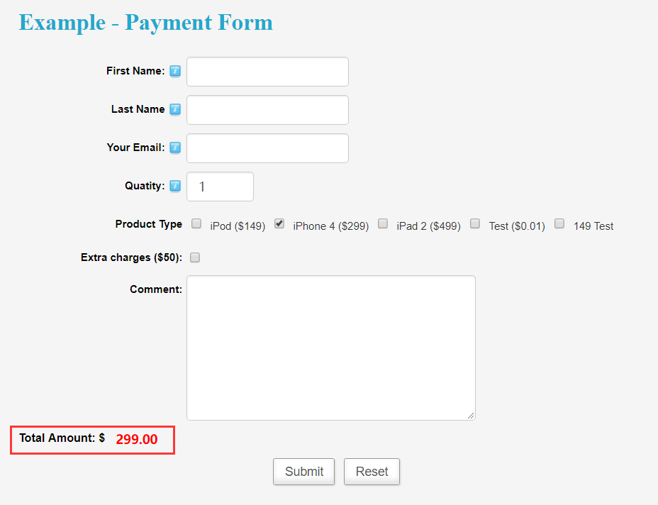
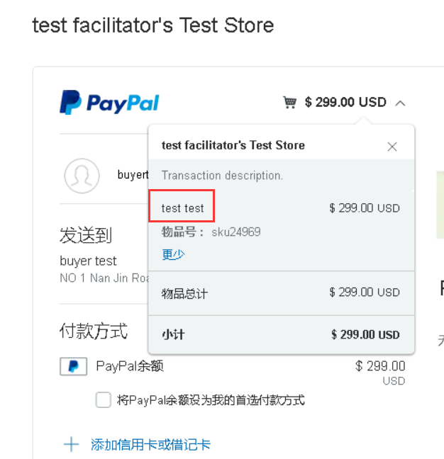
Display Total Amount: Whether to display total amount. If you want to configure one calculation or payment form, this option should be checked.
See an example as below.
Formulas: It’s the formula which can be used to calculate total price in the form.
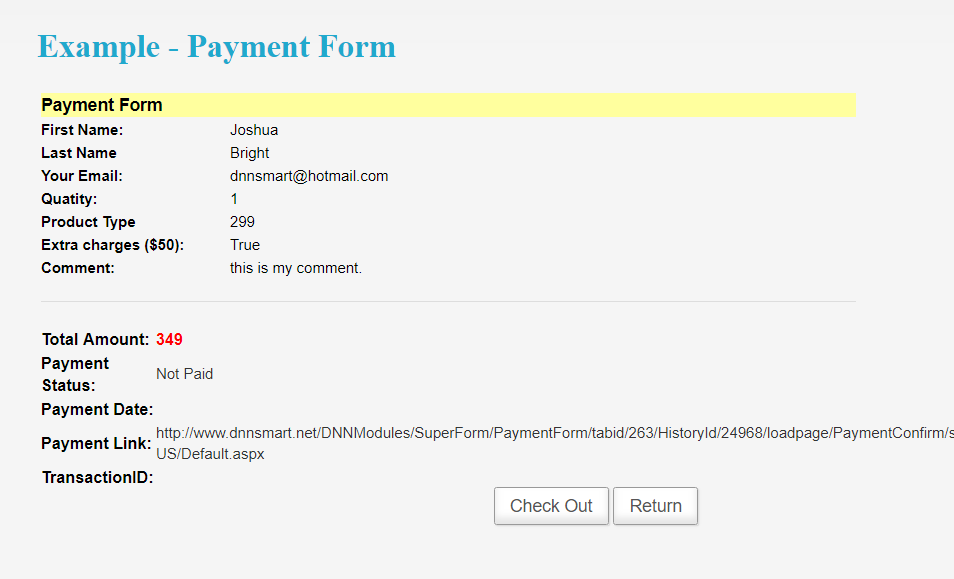
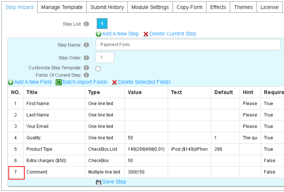
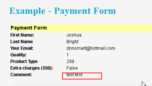
Payment Item Name: It’s the item name of payment. Please see some screenshots below, then you will see what an item name is.
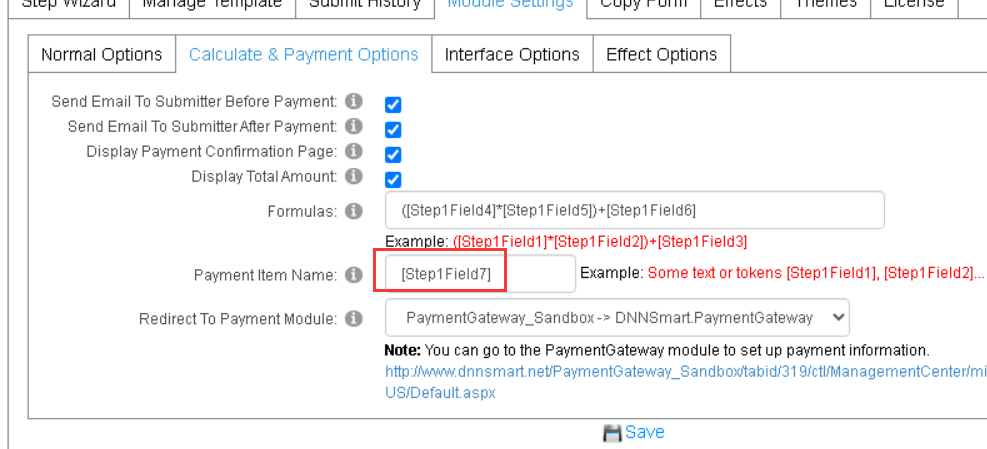
Redirect To Payment Module: Redirect to which payment module to pay.
Note: You can go to the PaymentGateway module to set up payment information.
If you have not installed the DNNSmart.PaymentGateway module, please go to the Host->Extensions page to install it. Then add it to a page and the user will be taken to that page for payment when making a payment.
Interface Options
Form Template: You can define form template here, including postion of submit button and location of form.
Submit Result:The template of submit result. It can support tokens: [HistoryId] [Country] [IP] [CreatedDate] [TotalAmount] [PaymentStatus] [PaymentDate] [PaymentLink] [TransactionID] [UrlReferrer] [ActualPageUrl] [Step1Name], [Step2Name], [Step3Name] ... [Step1Title1], [Step2Title1], [Step3Title1] ... [Step1Content1], [Step2Content1], [Step3Content1] ... [Step1WhitePaper1],[Step2WhitePaper1],[Step3WhitePaper1]...
Module Style CSS: You can edit content which is included in module.css here.
Effect Options
S002_SlideOut & S004_SlideOut_FromRight Settings
Trigger Image: You can upload a new trigger image here, this settings is valid in effect “S002_SlideOut” and “S004_SlideOut_FromRight”.
S003_Popup Settings
Button Position: Admin can configure the position of the submit button, there are three options which are in the module, floating left or floating right. See below.
In the module
Floating left
Floating right
Button Type: Please select a type of the submit button, it can be a normal button or an image button.
Button Image: You can upload a new submit button image here.
Copy Form
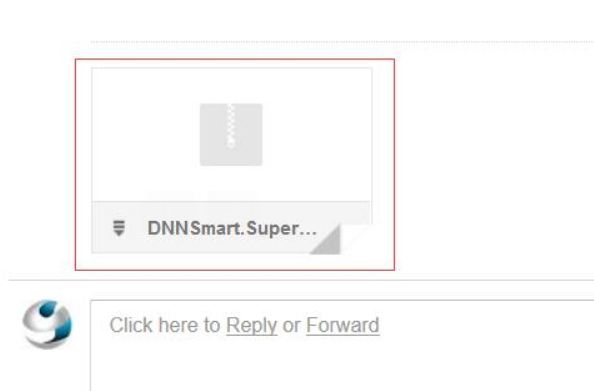
On this page, you can export module configuration to one xml file. After that, you can go to another site and import this xml file, then the same configuration is copied.
Effects
On this page, you can configure how the form will present. There are five kinds of effects predefined, they are S001_Normal, S002_SlideOut, S003_Popup, S004_SlideOut_FromRight and S005_SlideDown. There’s one “Apply Effect” button on the right of each effect, you just need to click it when you want to use this effect.
Themes
On this page, you can customize the look and feel of form in order to help it match your site design. You can create a theme for Super Form module, you can also upload, edit, export or delete themes here.
1,Edit Current Theme
Theme Style CSS: You can edit content which is included in theme.css here.
2, Install A New Theme
If you want to upload a new theme, you can't drag the file into exported zip file directly. You need to unzip the exported zip file, then repack it and upload.
3, Available Themes
Applied theme will display here, you can also export and delete themes.