How to build your form?
After you click “Dashboard”, you will enter following interface.
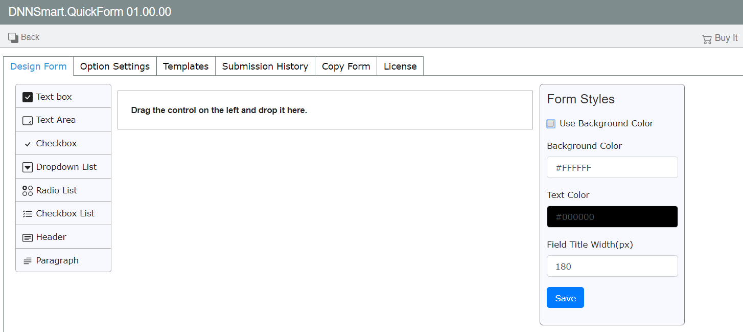
Design Form
On this page, you can build your form such as adding and editing fields & controls. You can also customize form appearance through “Form Style” editor.
This interface includes three sections. In the left panel, all fields and elements display and they can be added to the form. You only need to simply drag and drop them into the middle area. In the middle panel, it’s the form preview, where you can manipulate each of components. In the right panel, it’s a visual form style editor, where you can customize the appearance of your form. You can change background color, text color and the width of field title.
How to add a field?
Building your form starts with adding fields, please follow steps below.
1.Please place your mouse over one field in the left panel and drag it to the middle area.
2.Please enter the middle area and there’s a box which will indicate where to put the field. Please see a sample below, you can put the field in the box.
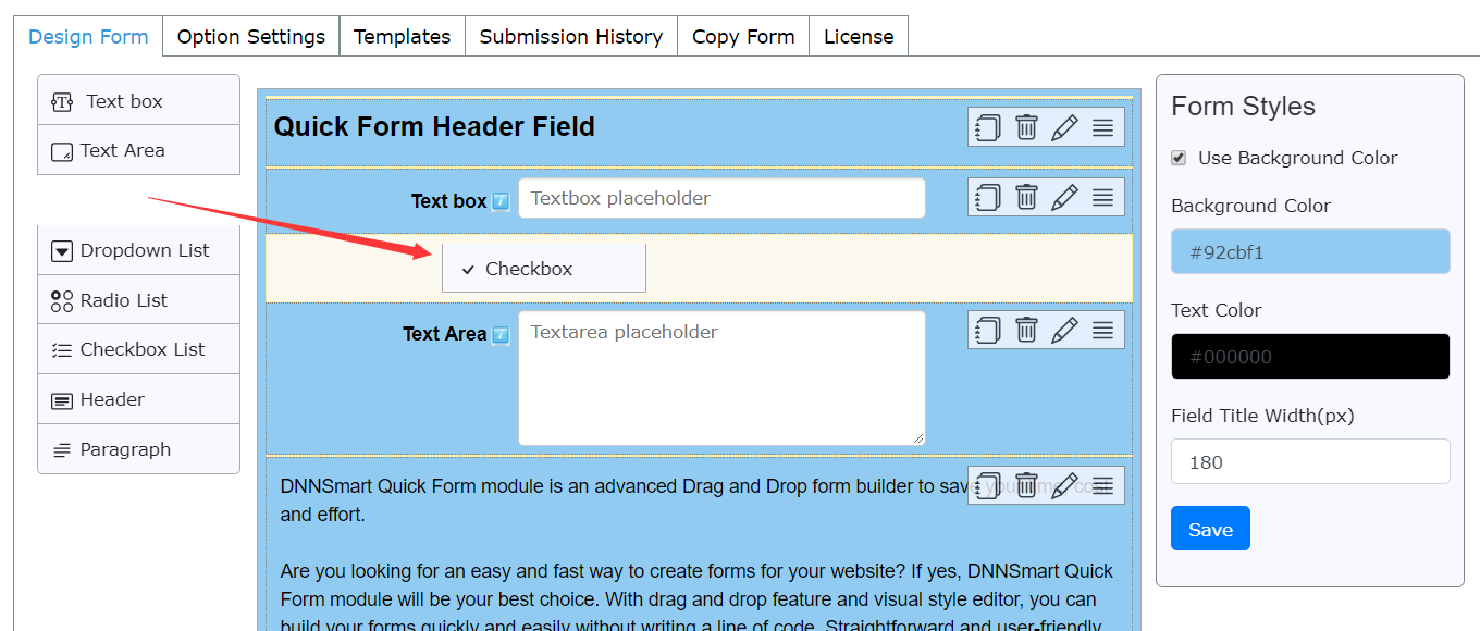
3.Please drop the button once you place it where you need.
How to edit a field?
Building your form starts with adding fields, please follow steps below.
1.Please click pencil icon in each added field, then a window will pop up.
2.Please edit options according to your need.
3.Please click “Save”.
Options in each field will be slightly different, next we will explain them one by one.
Text box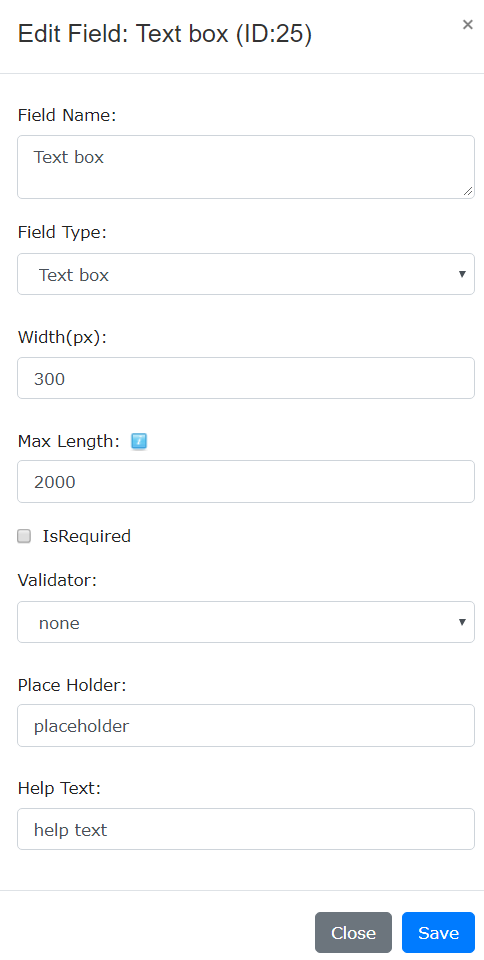
Field Name: Please input a name for this field.
Field Type: You can choose one field type from dropdown list. Width: You can define the width of textbox.
IsRequired: If you check this option, this field will be mandatory.
Validator: Please choose one validation method from dropdown list.
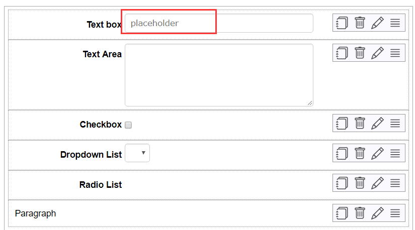
Place Holder: Please input text here, then it will display in the textbox. See an example below.
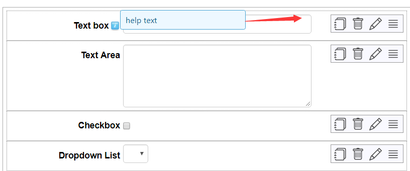
Help Text: Please input text here, then the text will display when your mouse hovers over the blue icon on the right of the field. Please see an example below.
Text Area
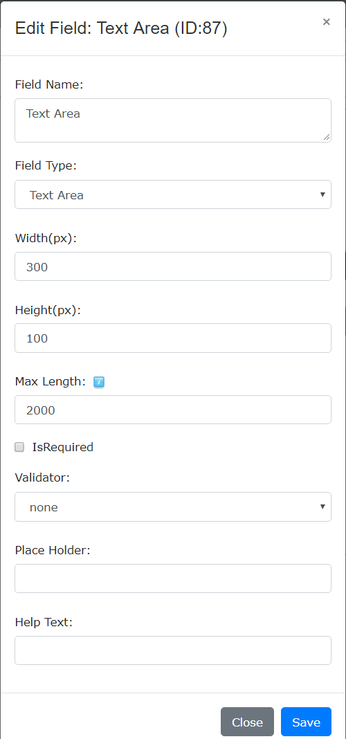
Height: You can define the height of box in which users can input text.
For explainations on other options, please refer to Text box above.
Checkbox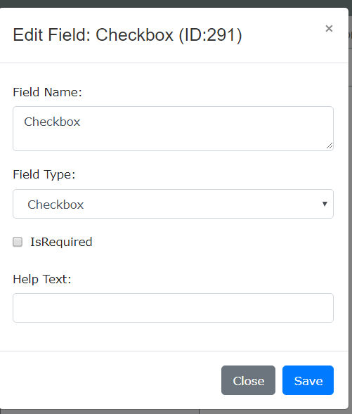
For explainations on options, please refer to Text box above.
Dropdown List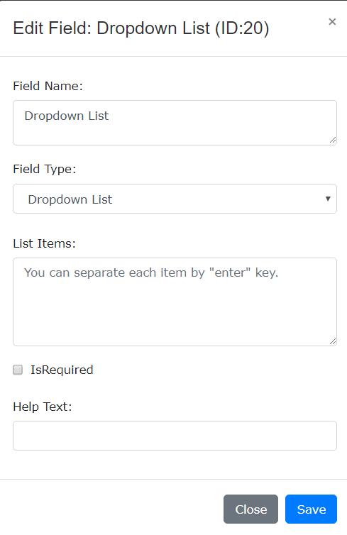
List Items: You can input items which will display in the list, separating each item by “enter” key.
See an example below.
Back-end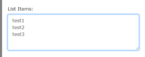
Front-end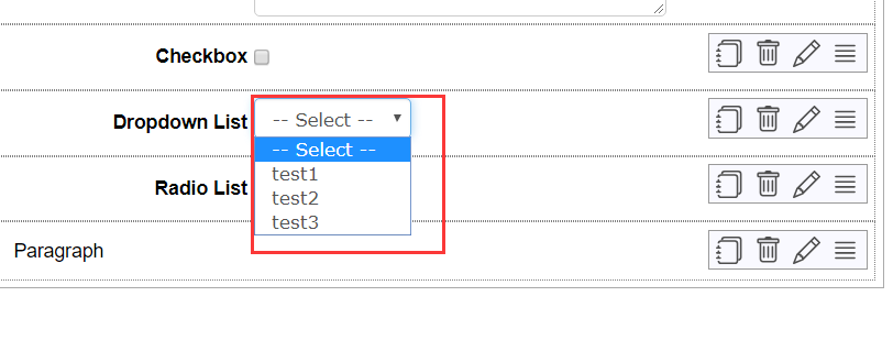
For explainations on other options, please refer to Text box above.
Radio List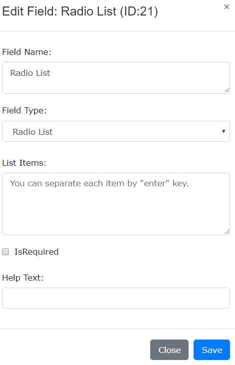
For explainations on options, please refer to Text box above.
Checkbox List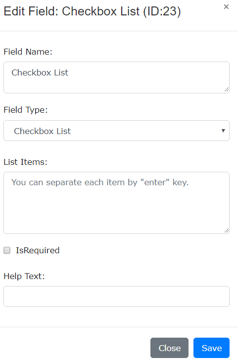
For explainations on options, please refer to Text box above.
Header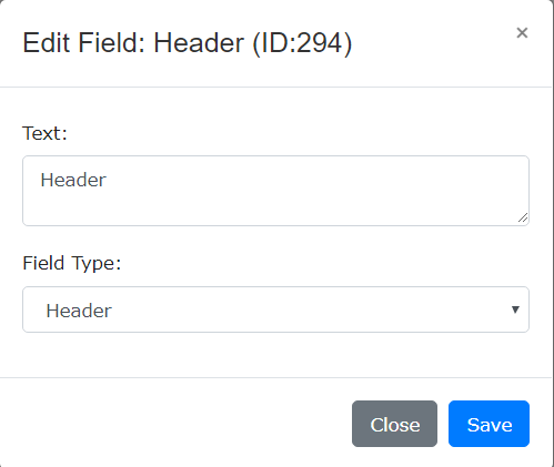
Text: Please input text here.
Paragraph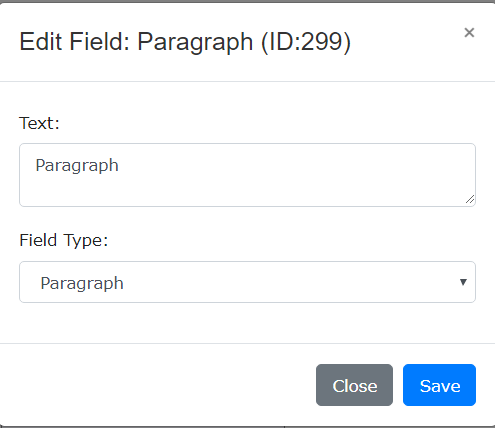
Text: Please input text here.
How to reorder fields?
1.Please click sort icon and hold. See below.

2.Drag the field up or down according to your need.
3.According to where you drag the field, an active zone will appear and you can place the field in it.
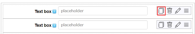
How to copy a field?
Please directly click the copy icon to copy a field, then duplicated field will appear below.
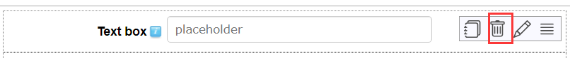
How to delete a field?
Please directly click the trash icon in the field, then this field will be deleted.
How to define form styles?
In form style section, you can change the look and feel of the form through changing background color, text color and the width of field title.
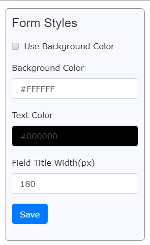
Use Background Color: If you uncheck this option, then the form won’t have any background color.
Background Color: Please click the control, then it will appear one color picker and you can choose one background color according to your need.
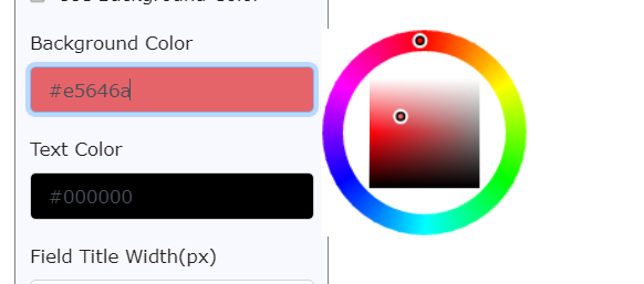
Please note: This option will only be valid after you check option “Use Background Color”.
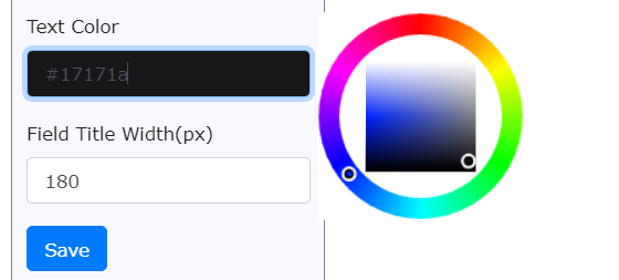
Text Color: Please click the control, then it will appear one color picker which allows you to change the color of all texts in the form.
Field Title Width: You can define the width of field title according to your need.

Option Settings
On this page, you can do some basic settings for the form.
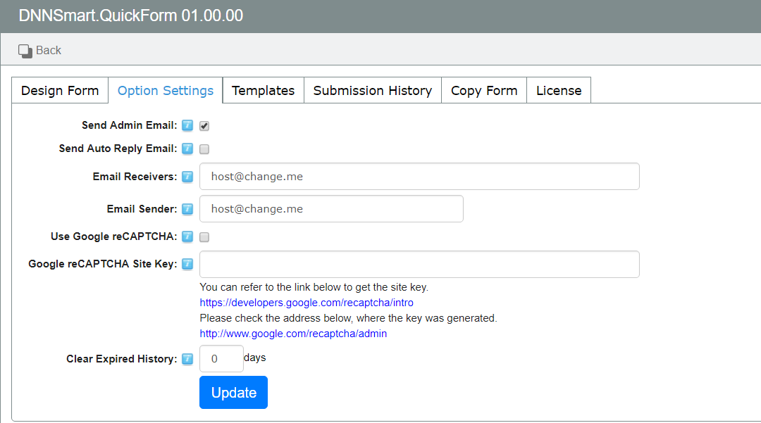
For explainations on all options, please see below.
Send Admin Email: After checking this option, it will send an email to admin after users submitting the form.
Send Auto Reply Email: After checking this option, it will send an auto reply email to submitters after they submit the form successfully.
Email Receivers: It represents email receivers of the form, you can add Email addresses separating by a semicolon (;) here.
Email Sender: This is the email sender of the form, please input an email address. Email sender won’t receive any email, it only presents who sends emails to submitters. After the submitter gets an email and he clicks “Reply” button, Email sender will be filled as email receiver automatically.
Use Google reCAPTCHA: After checking this option, Google reCAPTCHA feature will be enabled.
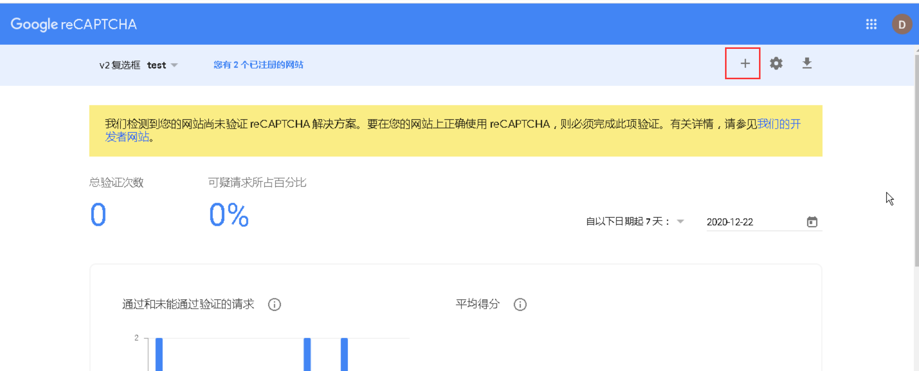
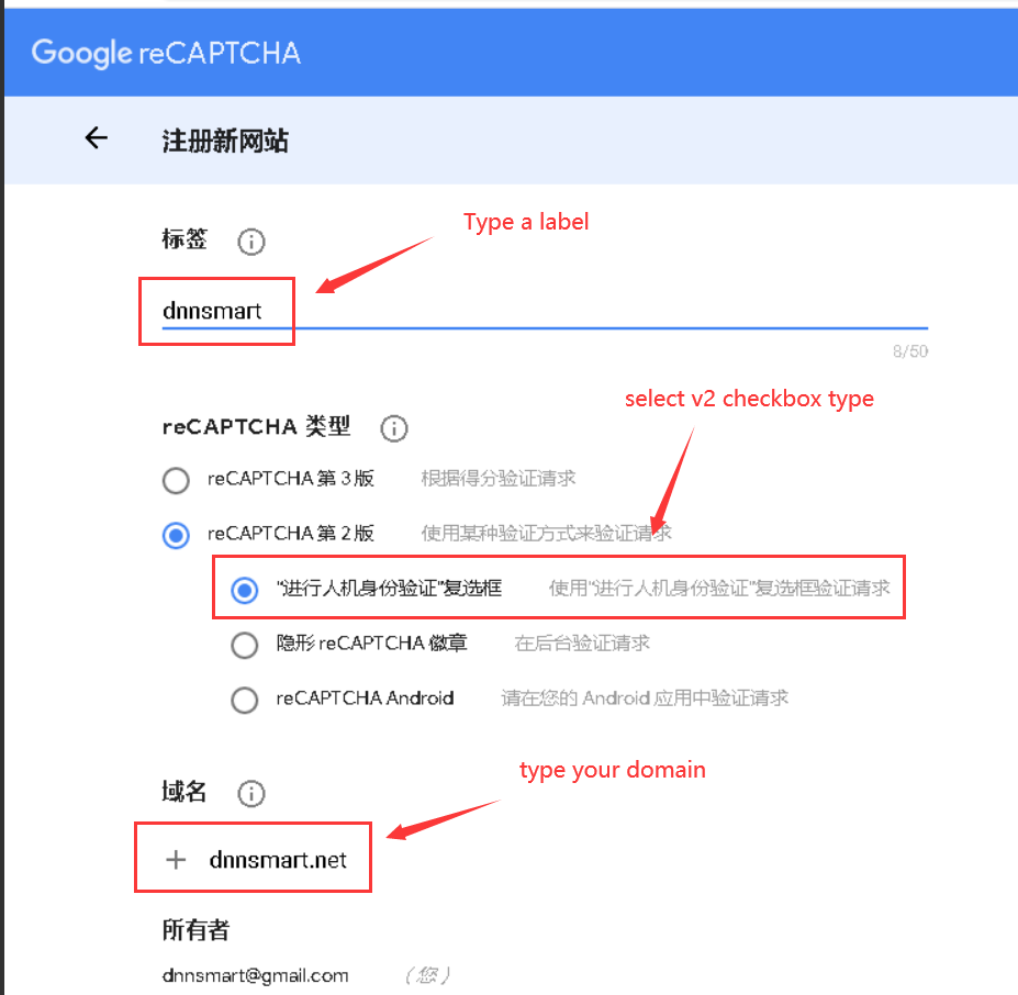
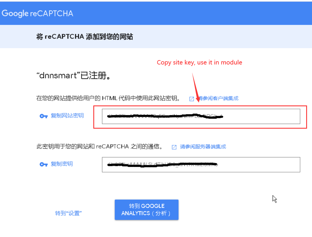
Google reCAPTCHA Site Key: Please follow instructions to get one key and input it here.
You can refer to the link below to get the site key.
https://developers.google.com/recaptcha/intro
Please check the address below, where the key was generated.
http://www.google.com/recaptcha/admin
Templates
On this page, you can define templates for admin email, auto reply email and submission result.
Admin Email Template
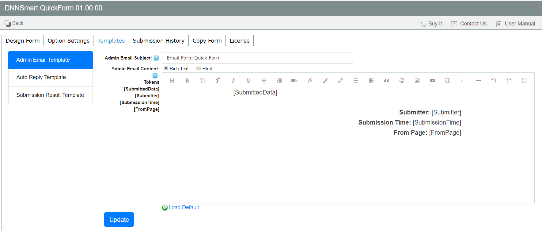
Admin Email Subject: It’s the subject of the email which will be sent to admin.
Admin Email Content: It’s the template of the email which will be sent to admin, you can load default template or customize the template according to your need.
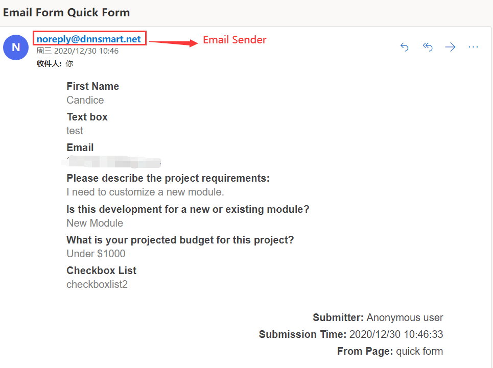
Please see a sample below, it’s an email which was sent to admin after a user submitted the form.
Auto Reply Template
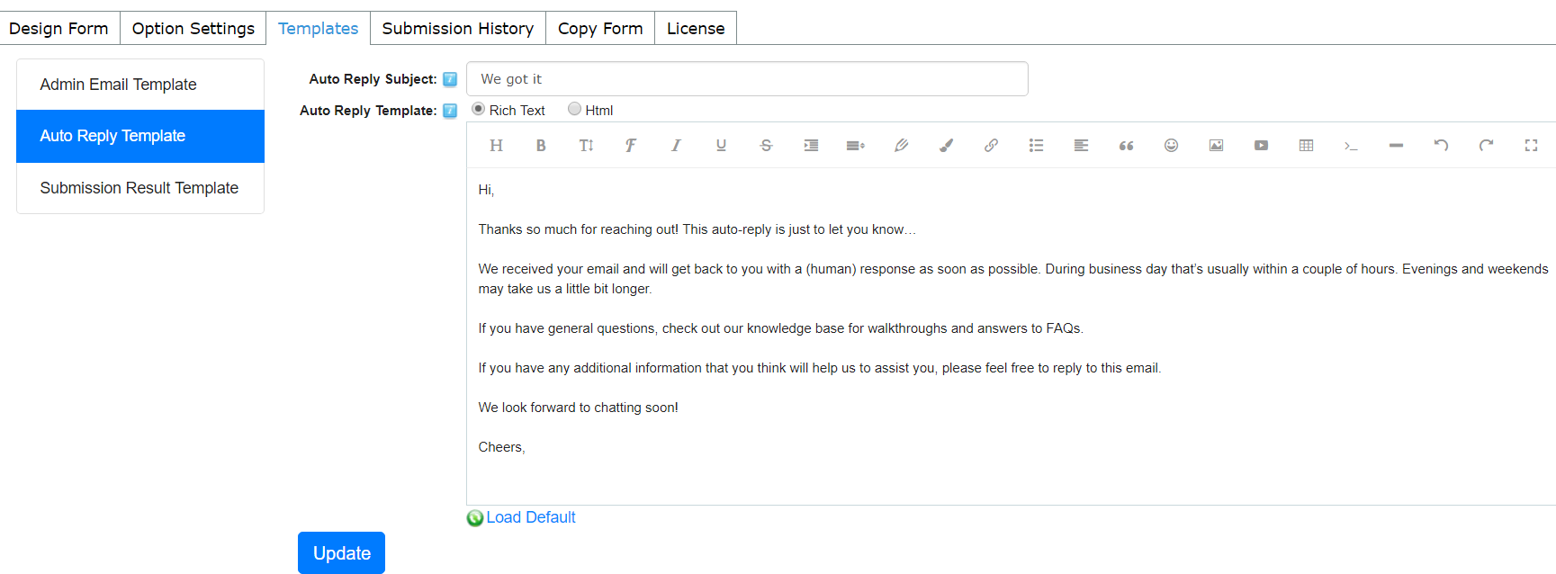
Auto Reply Subject: It’s the subject of the auto reply email.
Auto Reply Template: It’s the template of the auto reply email, you can load default plain text or input the text according to your need.
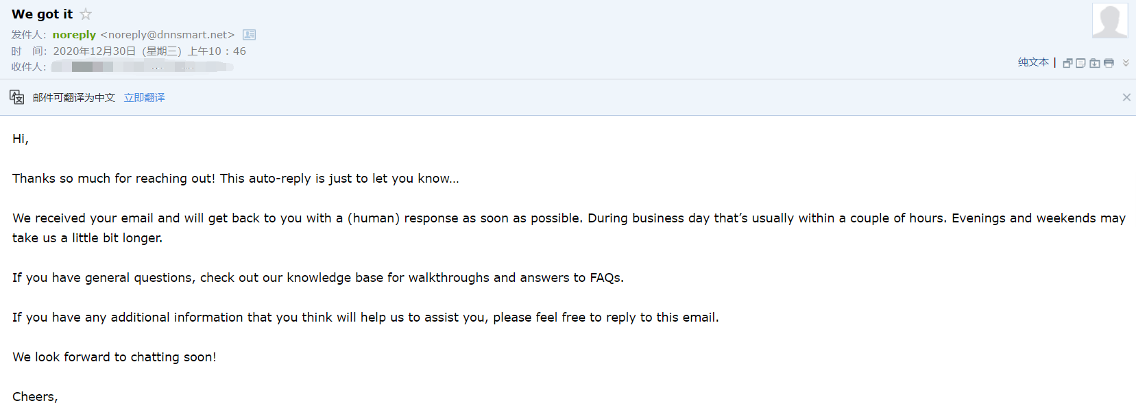
Please see a sample below, it’s an auto reply email which was sent to the submitter.
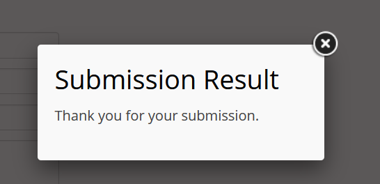
Submission Result Template
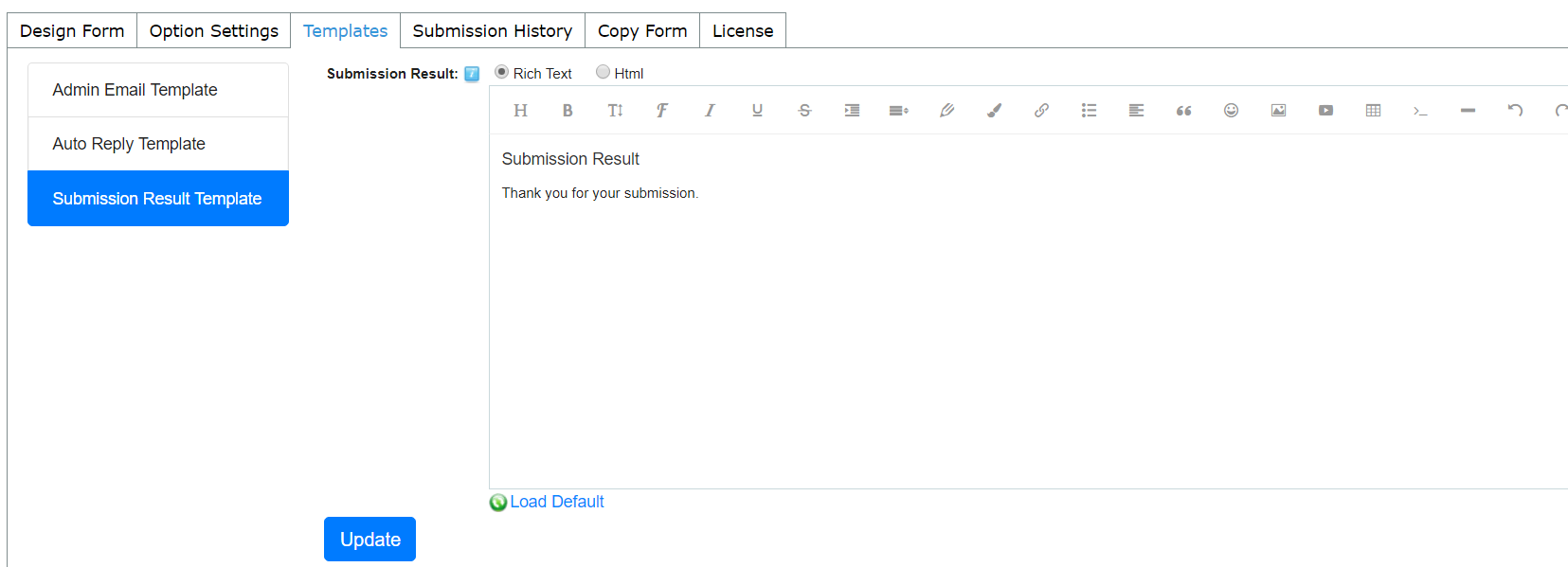
It’s the template of submission result, you can load default plain text or input the text according to your need.
Please see a screenshot below, this interface displayed after users submitted the form.